APT Member Highlight- Duncan Noel Campbell
Name: Duncan Noël Campbell
Position: Art Director, U of R Press
URFA APT Member Since: I’ve been at the University since January 2009, so it’s approaching 11 years as an URFA APT member.
Provide a description of your position, and what a “day in the life” at your job might look like:
No day is ever the same. U of R Press is a very collaborative unit so you get to hear about and contribute to discussions that don’t necessarily involve your role directly. Also, there are always new things coming up, exciting new projects and interesting problems to solve. My role at the press, in simplified terms, is to create and maintain a high level of quality to the “look” of the press: anything we create that goes out in the public sphere has to meet my approval, and that includes all our book cover designs and book interiors. As the only in-house designer at the press all the covers and most of the book interiors fall to me to design (I oversee the few interiors that get farmed out to others). All promotional pieces like ads, posters, catalogues, promo postcards etc. are also designed by me too and have to meet a high level of graphic design and professionalism.
What about your position is the most rewarding?
I love that I get to use my skills to bring books into the world — and I get paid to do it! How great is that? Graphic designers often find opportunities in the world of capitalism and advertising, which doesn’t align well with my personal interests. Here I get to work on important things like the dissemination of knowledge through our academic publications and participate in the revitalization of Indigenous Languages through our First Nations Language Readers and Indigenous Languages for Beginners series. I feel very fortunate and honoured to be involved in that work.
What is the most challenging?
I think the fast pace of my job can be a double-edged sword. By necessity, designers have to be deep thinkers and ponder-ers. It’s all about solving complex communication problems and presenting them clearly in a visual format. And for that you need time. However the world of publishing is very deadline driven and fast paced, so an old man like me gets tired. I always seem to get it done though.
What’s your favorite part of working at the U of R?
Having a front row seat to all the interesting visiting scholars and artists. There is always something interesting going on here to see and experience.
What’s something interesting about your job that most people might not know about?
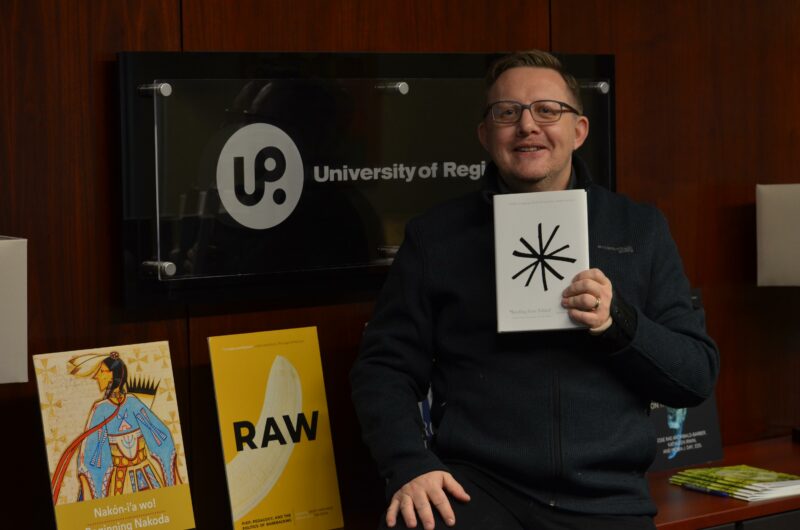
I designed a book about bums that received a number of design awards and garnered some international attention for the design. The book, “Reading From Behind, A Cultural Analysis of the Anus,” by Jonathan A. Allan, and published by U of R Press in the Spring of 2016, has an irreverent title but was a solid academic book by a talented scholar. The design challenge for me was to acknowledge the cheeky nature of the book and its title, while maintaining an air of sophistication and not incurring the wrath of censors. I knew I couldn’t put a butt on the cover but in man y ways the book really required it! The design solution turned out to be very simple: a large hand-drawn asterisk which was both a nod to the work of Kurt Vonnegut and a reference to our cultural puritanism (we often use asterisks to replace swear words when writing). The cover was well received and was even featured in a weekly column on book design in De Volkskrant, a Dutch daily newspaper. It really was a designer’s once-in-a-lifetime opportunity to have such a crazy problem to solve land on your desk.